Old meets new - A renovation with an eye to the past
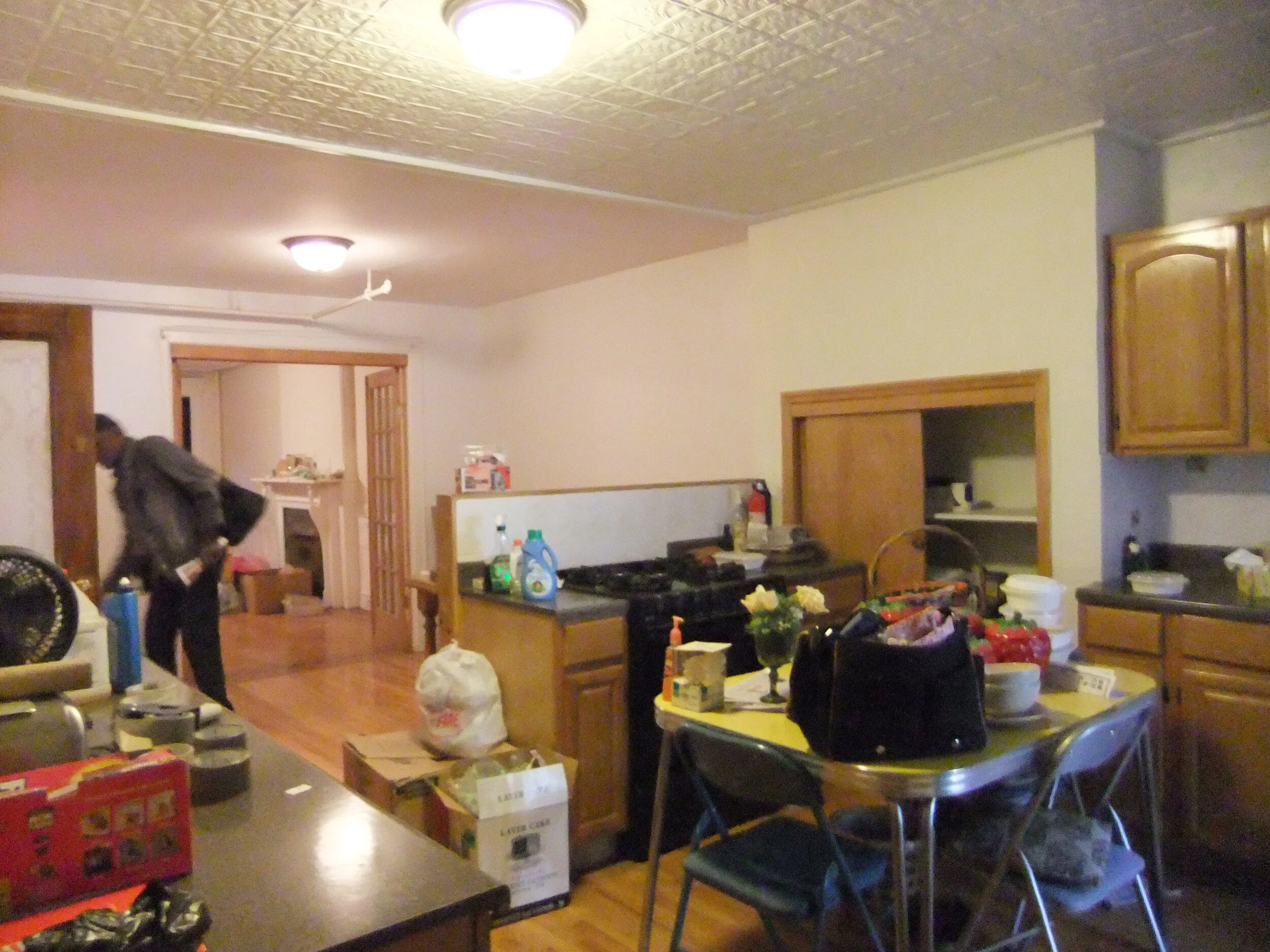
We've just completed a renovation in Bed-Stuy for an out of town client. It's a great example of walking in and saying, "what did they do?" That's really the best thing in this case - the goal was to make it look fairly untouched and keep an eye to the past. We kept original details and did a lot of clean up, but we avoided sheetrock and used a lot of careful painting from painter extraordinaire, Jamie Grubb. The project was just listed by Corcoran and both the client -- and CAVdesign -- couldn't be more happy with the results. Here is the garden apartment kitchen before. The chimney area had some storage, but it interfered with the possibility of extra counter space.
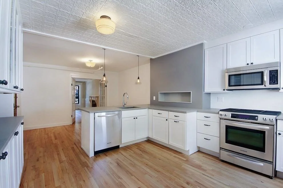
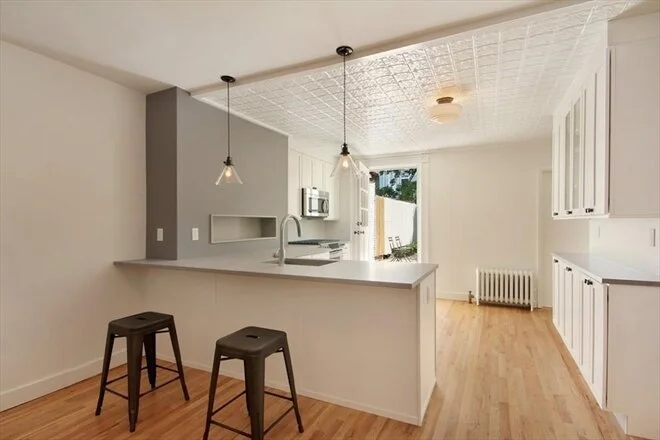
The solution: We placed a niche inside the space and opted for better counter space and storage. The chimney wall was painted as a feature area and became a handsome detail.
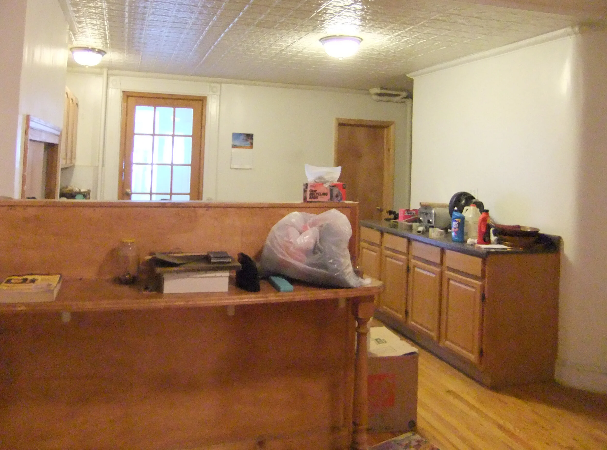
The overall layout was not bad, and I actually liked the idea of the peninsula with additional seating. But, in this case it was too high, too shallow, and too, well, ugly.
We made the bar area counter height to increase the useable counter space and open things up, and put shallower base cabinets on the right side to create a more open plan.
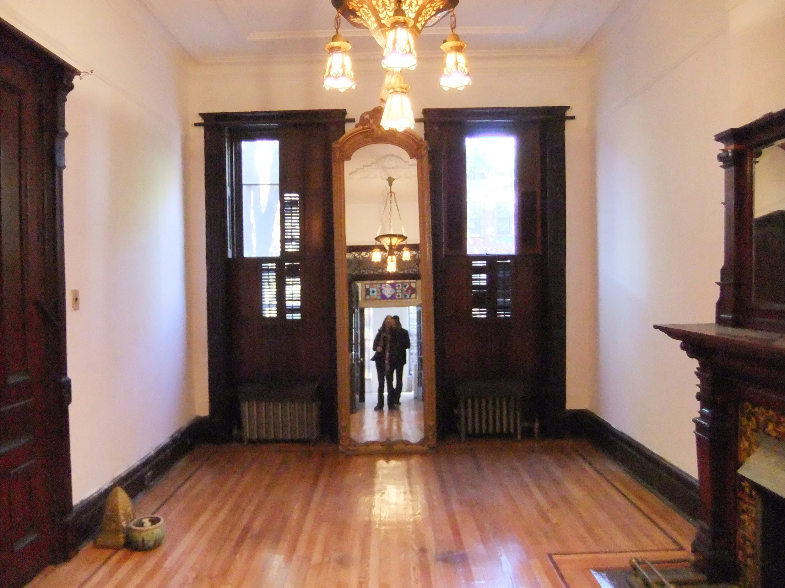
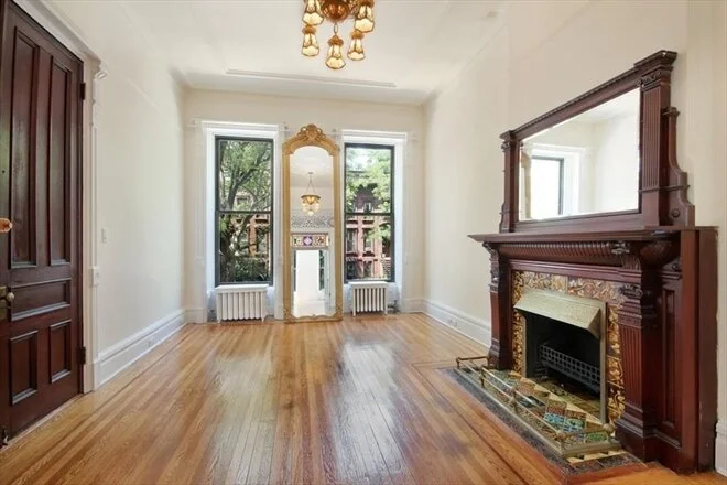
The parlor floor was in decent shape but needed painting. The owner was wonderful about investing in expenditures like re-wiring the original light (which was dangerously not to code).
We opted to paint some of the woodwork to brighten up the space. It was in poor shape and in the end, it really did work to the advantage of the space. We kept anything in good enough shape as original.
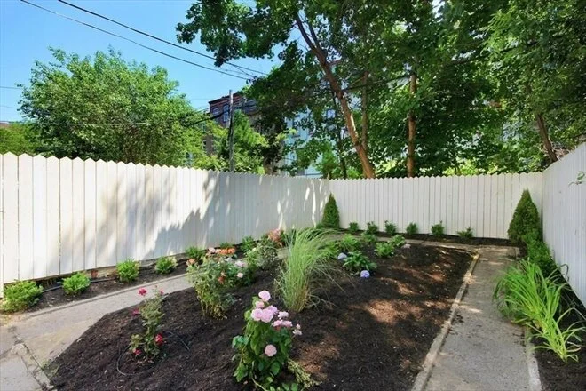
Final touches included a cleanup of the backyard with landscaping.
This extraordinary client was so understanding about what it would take to do these upgrades and more (including a full electrical upgrade). If you ever are considering investing in an older building, keep in mind that holding on to original details may cost more than covering them over. In this case, we tried not to go overboard, but held on to the best of the detail while gently sheparding the building into the 21st century.
Photo Credits: Courtesy of Jennifer K. Levy and Corcoran.com

