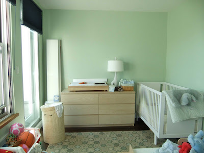
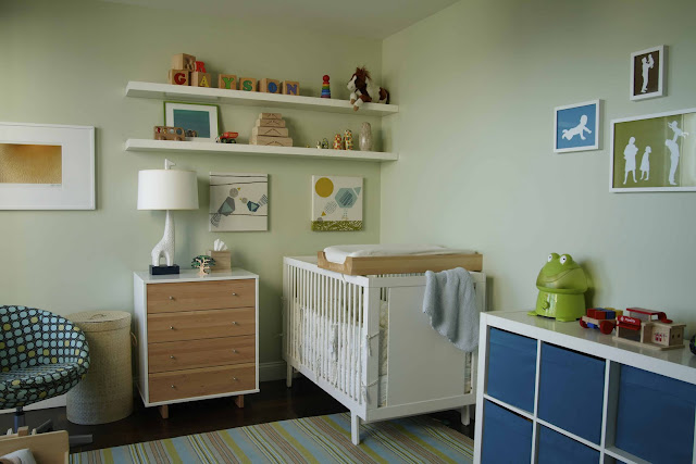
Before and After: Custom art +small changes = big results in a kids room
This project was a kids room with a few restrictions: the paint color had to stay the same, the crib location had to stay the same, and there was a limited budget on furnishings. So, with this 'use-what-you-have' philosophy, I set out to see what we could do to liven up this room for a baby and a toddler. First, I asked the owner if there was any unused furniture pieces or items we could use, and it turned out she had a much-better looking chest of drawers -- in the closet! She also had two IKEA lack shelves and some artwork. The one thing I really wanted to change was the rug. Combined with the color of the walls, the room was feeling a little 'old lady-ish' for two kids. So, I found a nice striped Dash and Albert rug, that picked up the color but also incorporated some other colors for balance.


